10 Bracelet Color Combinations That Always Work
Colour is where bracelet design gets fun – and where it is easiest to freeze. These ten combinations are hard to get wrong because each one leans on a proven contrast or harmony. Try any of them as a repeating pattern on a single strand.
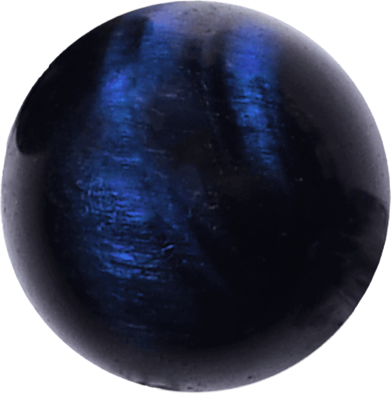
- Navy + gold – blue sandstone or lapis with gold hematite spacers. Rich, evening-ready.
- Grey monochrome – black agate, grey jasper and silver spacers. The greyscale test-proof palette.
- Terracotta + cream – red aventurine with white howlite. Warm and earthy, perfect for autumn.
- Amazonite + white pearl – soft sea-glass tones that flatter every skin tone.
- Black + turquoise – obsidian with real turquoise. The highest-contrast pair on this list; keep it to a 3:1 ratio.
- Amethyst + rose quartz – the purple-pink pairing that sells every spring.
- Tiger eye + matte onyx – glossy bands against a matte black. All texture, one colour family.
- Olive + amber – unakite with amber resin. Understated and masculine-friendly.
- Strawberry quartz + rhodonite – two pinks that differ in saturation; monochrome done in colour instead of grey.
- Full rainbow gradient – seven chakra colours arranged in a repeating run. Loud, but the strict ordering keeps it honest.
Two rules that make any palette better
First, one neutral for every two colours: spacers in silver, gold, matte black or cream give the eye a place to rest. Second, repeat every colour at least three times around the strand – a colour that appears once looks like a mistake, while three repeats read as a pattern.
Load any of these palettes into the bracelet designer, toggle the pattern to A-B-A-C, and you will have a gift-worthy strand in minutes. Or browse the gallery for combinations other makers have already proven.